
November 2025
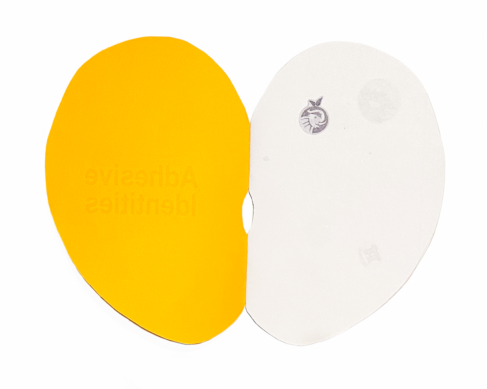
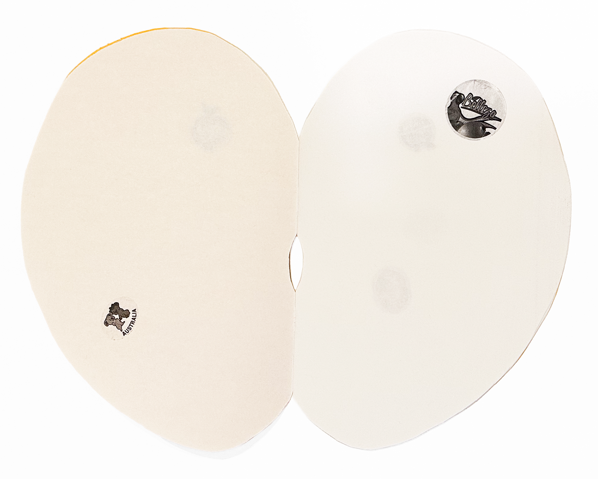
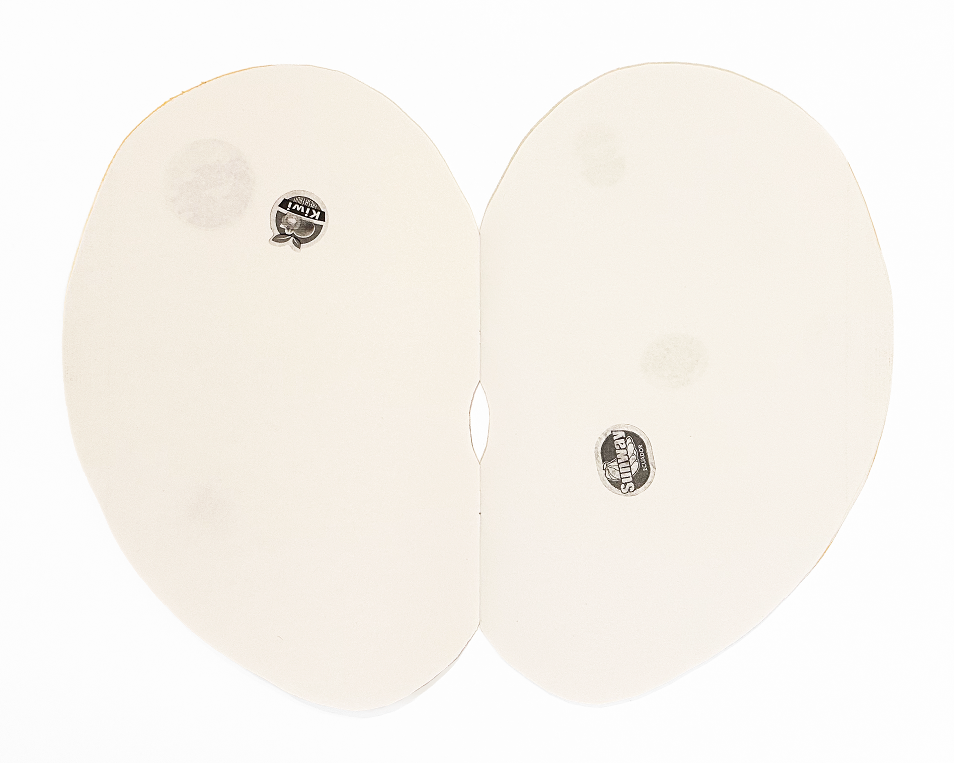
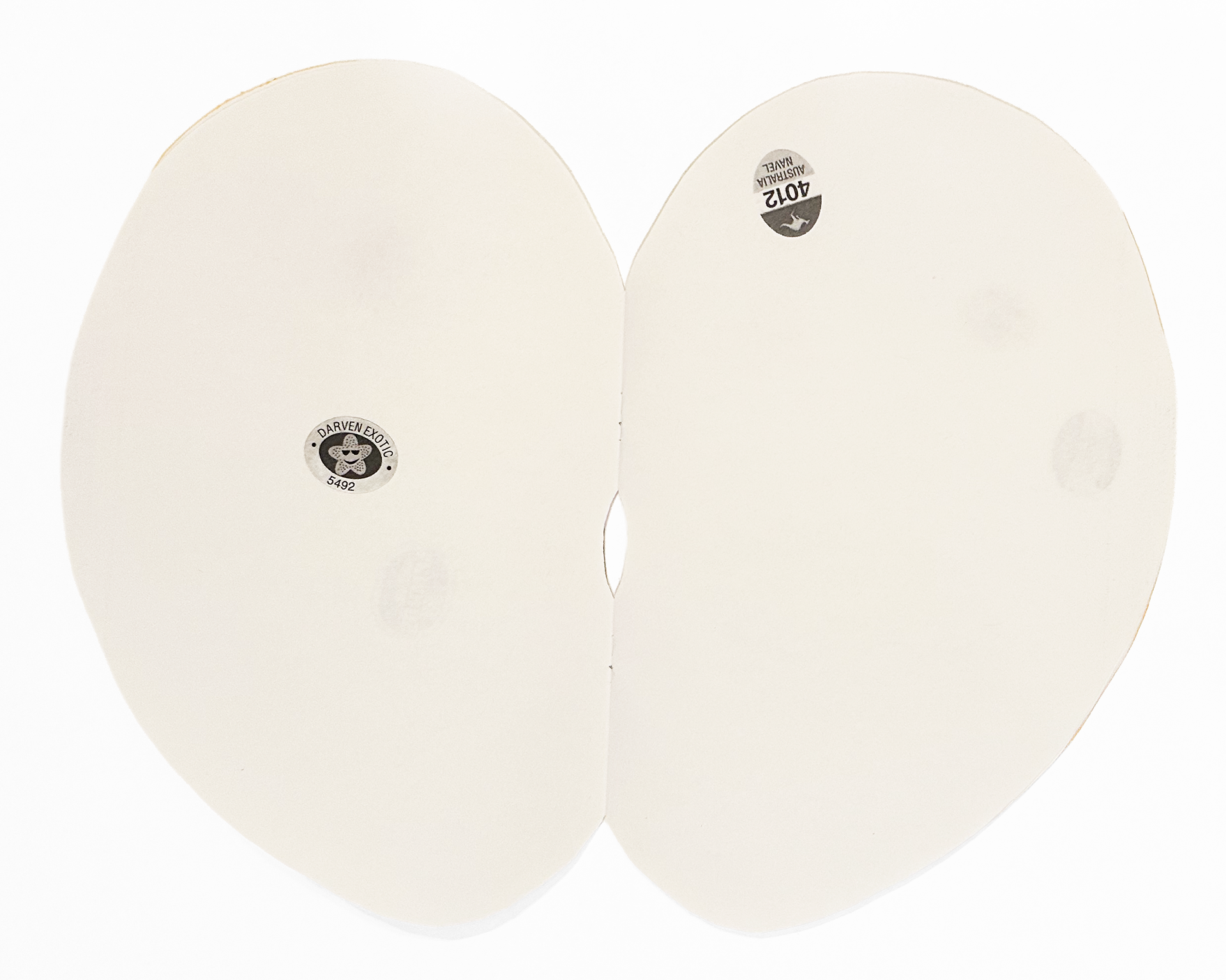
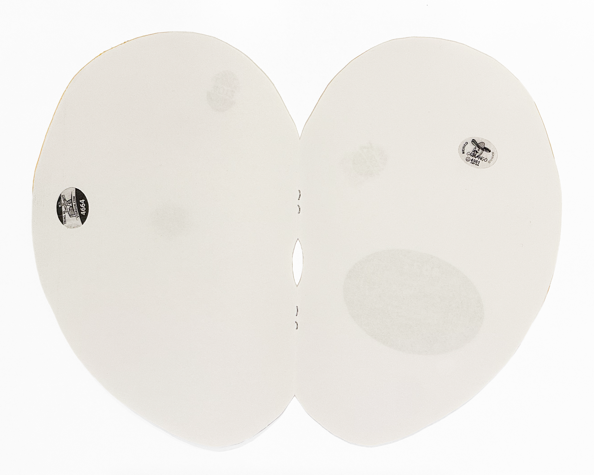
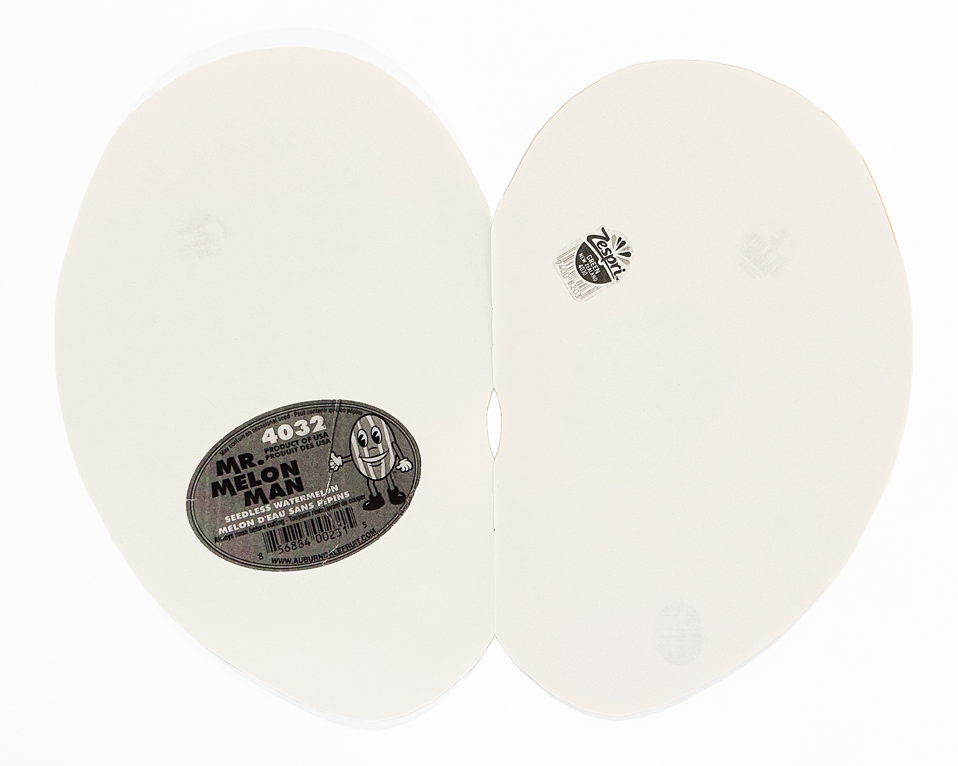
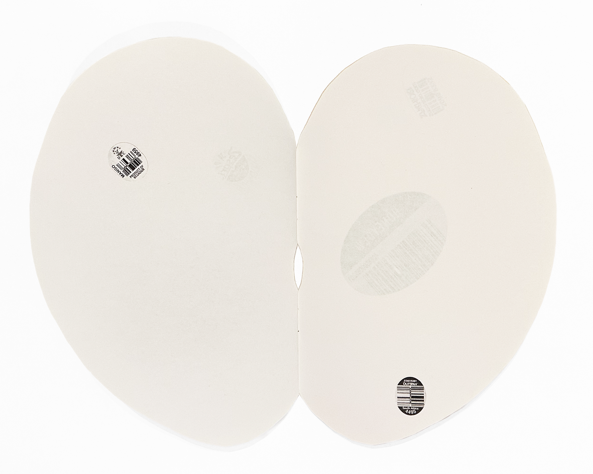
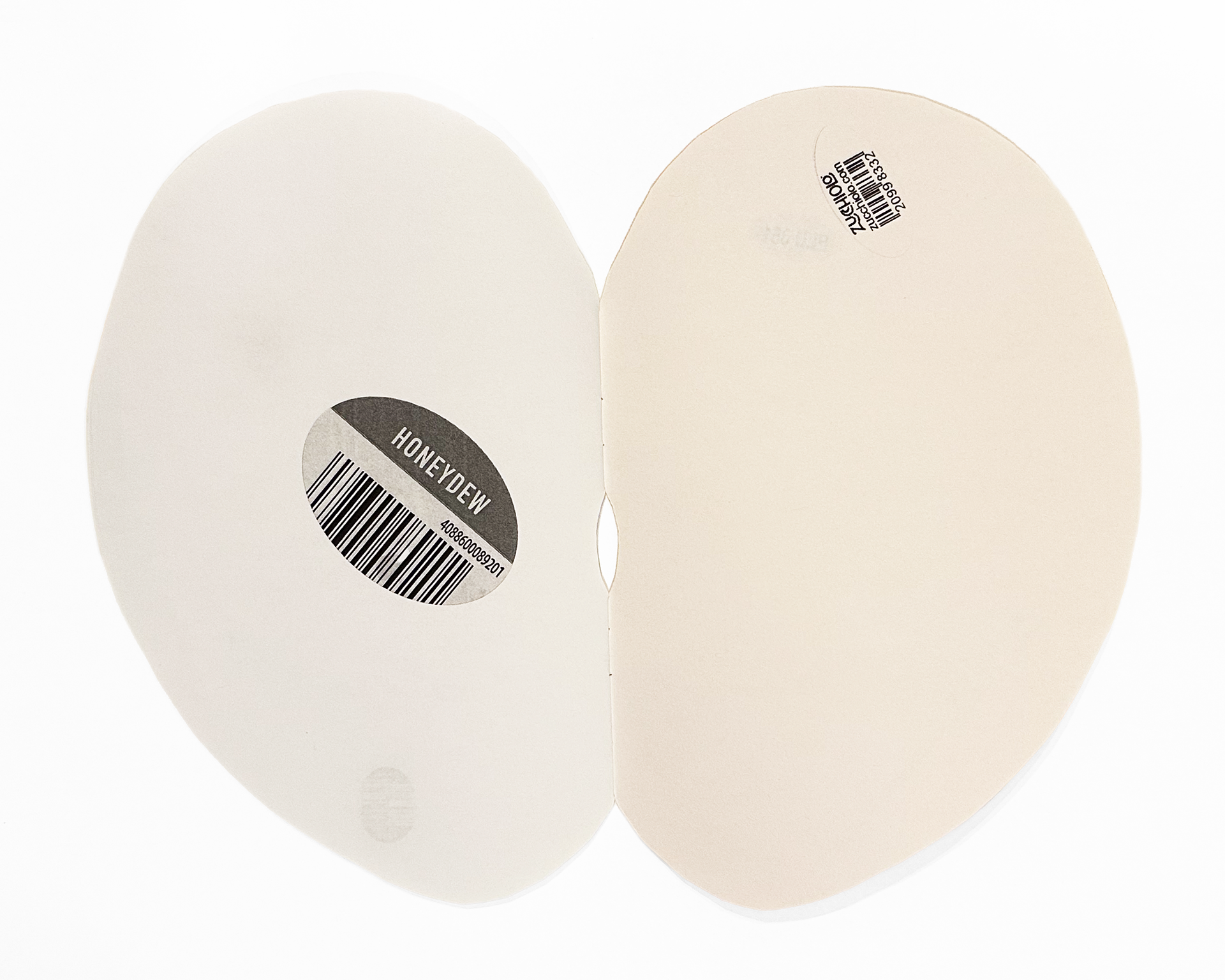
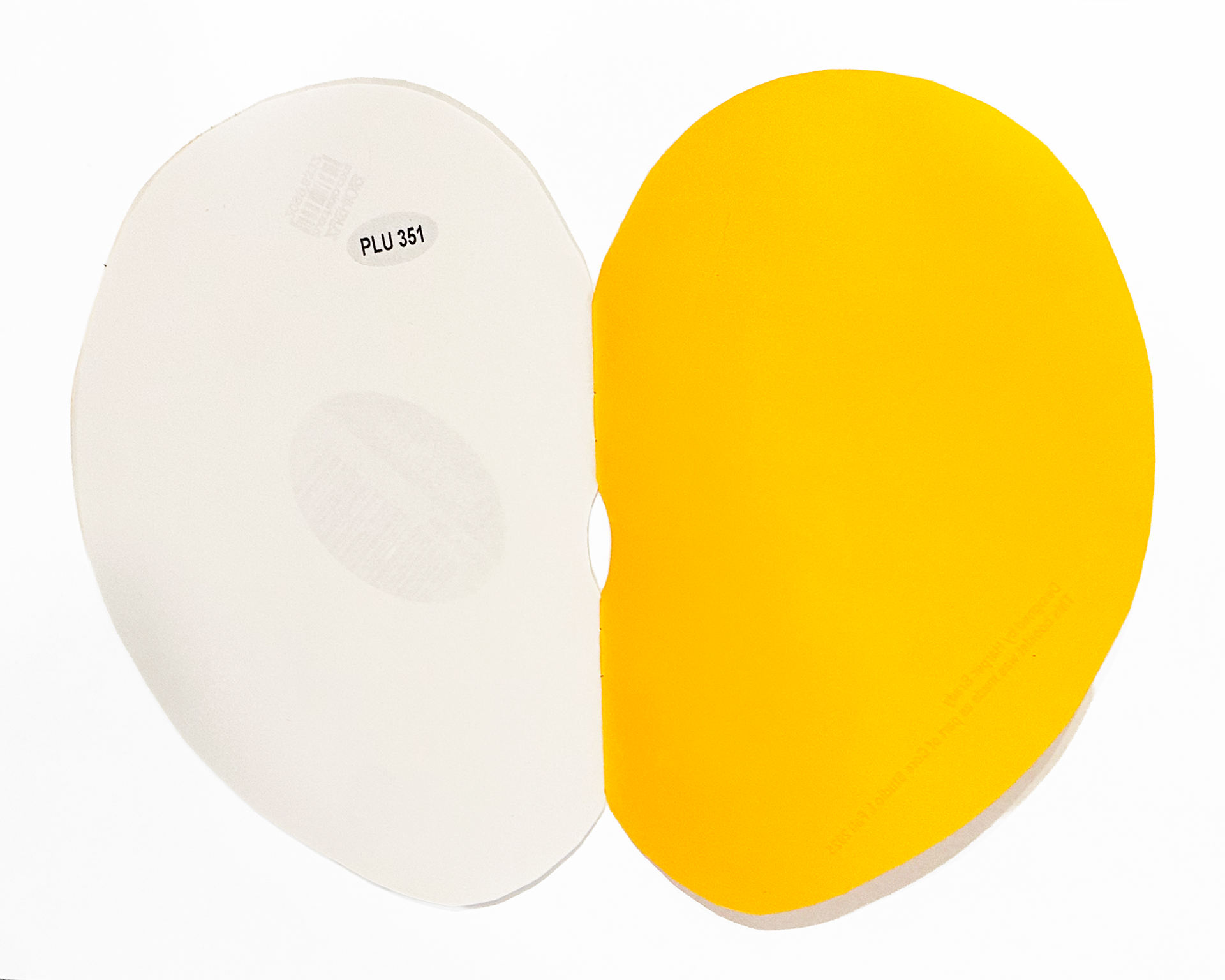
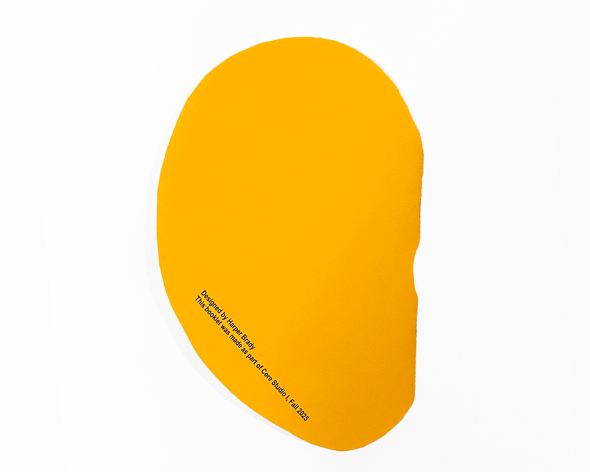
This is a project I created for one of my graphic design studios. I was given a collection of 200 images of fruit stickers, from that collection I had to choose 16 and arrange them in a narrative sequence. The parameters of this assignment were strict; I could only choose between 4 typefaces, text was only to be used on the cover, the book must be black and white with each page 5.5 by 8.5 inches, and there was to be no distortion of the images I was given. I decided to play with scale and placement, each fruit sticker is the size of its real-life counterpart. They are all placed in random places around each page, similar to how they would appear on an actual fruit. I chose a yellow paper for the cover and cut it to emulate the shape of a mango. While going through the collection of 200 images I noticed a pattern, most of the older vintage fruit stickers were very graphic focused, while the newer ones are very text and barcode heavy. I wanted to show the progression of how we have lost qualities of art and design, even in the small details of our lives, in pursuit of mass production.