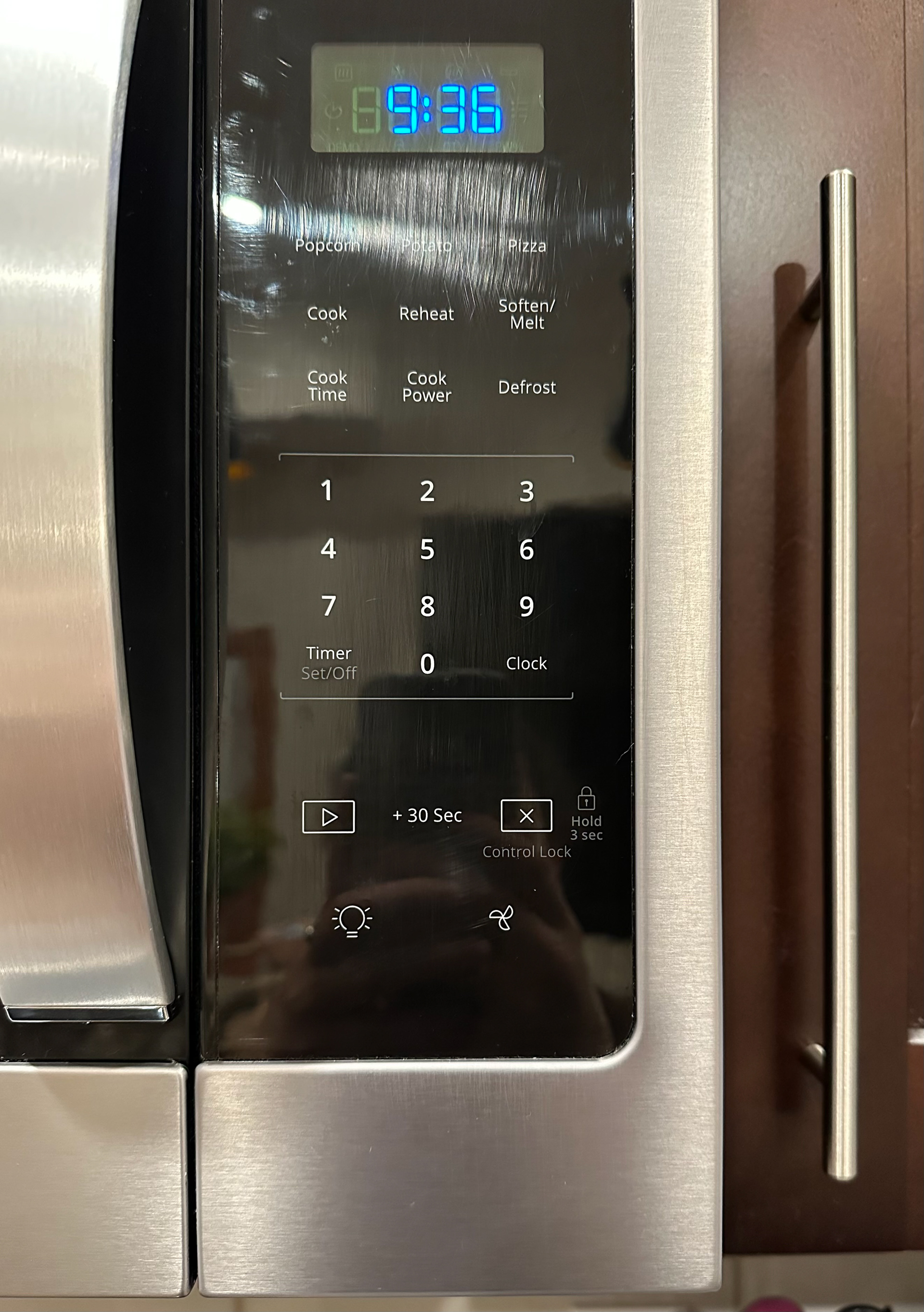

Representation 1: For my first representation I chose the buttons on my microwave. On top, there are numbers that you press to represent the amount of time you want to cook the food. Below those are symbols that represent the start button, the stop/cancel button, the button that turns on my stove light, and the button that turn on my stove fan. The start button is a sideways triangle in a box, like the play button used for music. The cancel button is the X in a box. The buttons for the light and fan look like simplified versions of their real-life counterparts. The time buttons use numbers, which we already associate to represent time. The start and cancel symbols do the same thing, we already associate a play button to mean start, and an X to mean stop or cancel. These representations function well in the context they are in but filter out almost all details to get their message across. If I saw these symbols out of context the fan and light bulb might not resonate as the objects they represent, distorting perception of their function.
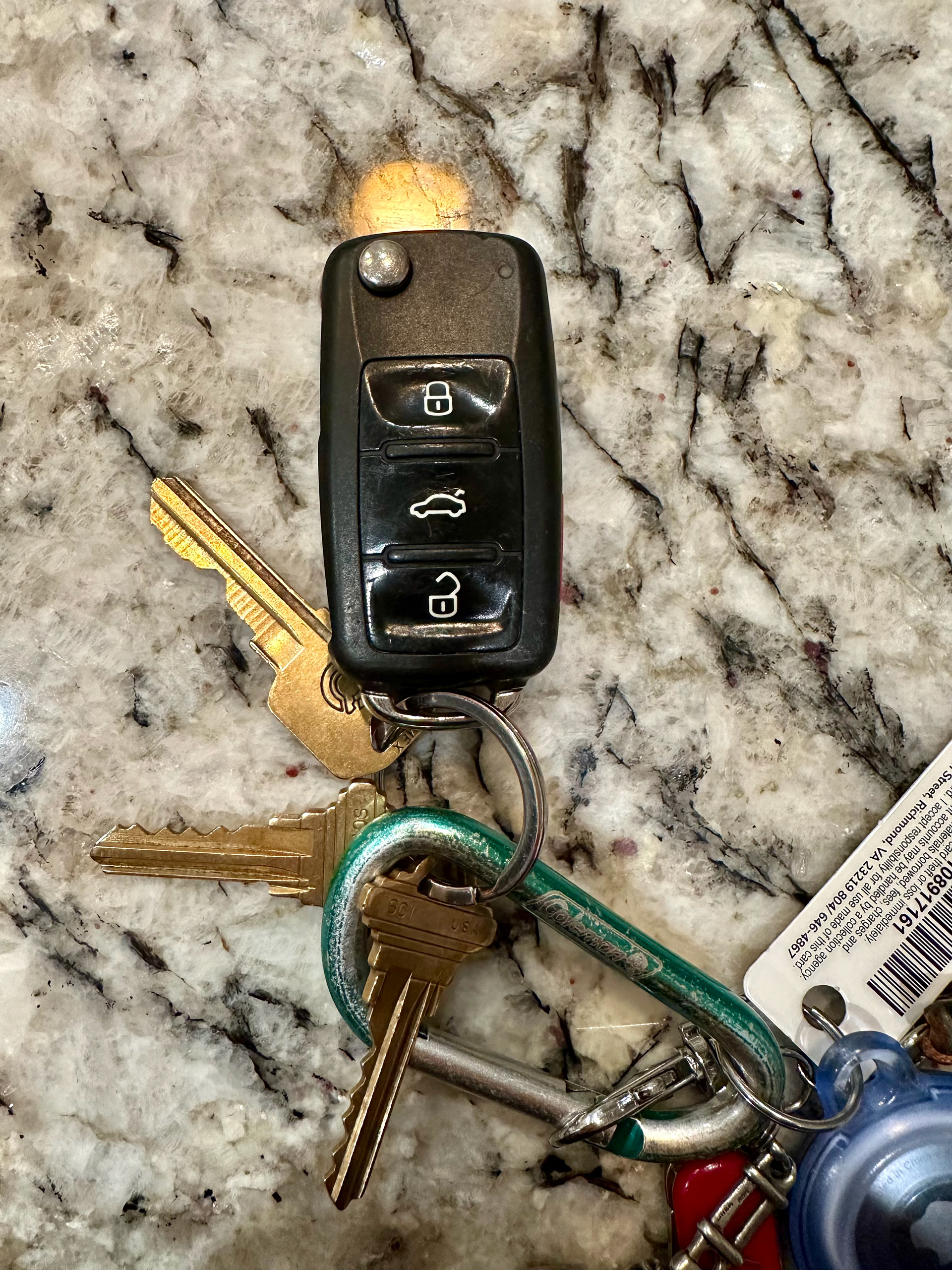
Representation 2: For my second representation I chose my car key. There are three symbols used, the lock, unlock, and open trunk buttons. My car key utilizes similar design features as my microwave. It oversimplifies real-life objects, to the point where it is only a white outline on a black background. To me these symbols seem clearer, outside of the context of my car key I would still be able to clearly tell that the locks are to lock and unlock. The button to open the trunk is a little less clear, but it is still recognizable as an outline of a car. This design filters out color, detail, and language, but this is an advantage since they are mass produced. I believe this representation is successful since it can communicate across languages and abilities to convey the same message, with the most important information clearly displayed.
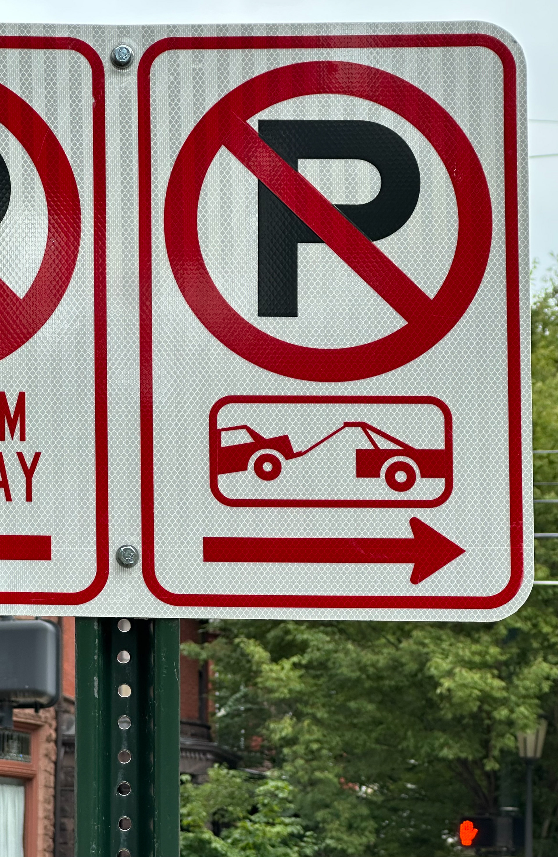
Representation 3: For my third representation I chose a no parking/tow zone sign. This sign shows an image of a P with a red circle and a diagonal crossed through it. Below that is an image of a tow truck pulling a car. Below that is an arrow. This sign tells you cannot park past this line, or you will get towed. I think this representation functions well. Even though it is distorted by losing most color, detail, and language it communicates its message clearly. You do not have to read English to put the pieces together. Most of the symbols it uses are universal and often seen in other traffic signs. The color red indicates this is a warning, it grabs your attention and signifies that there is something you should not do. The P stands for parking, but even if you do not know the word the images of the car and tow truck (along with the red circle with diagonal line) is enough to signify you will get towed if you park there.